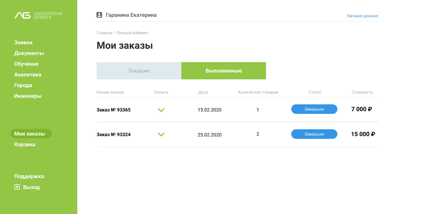
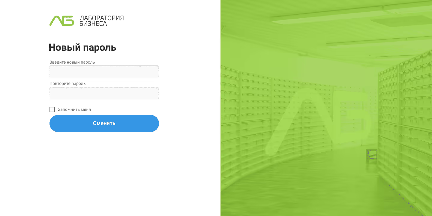
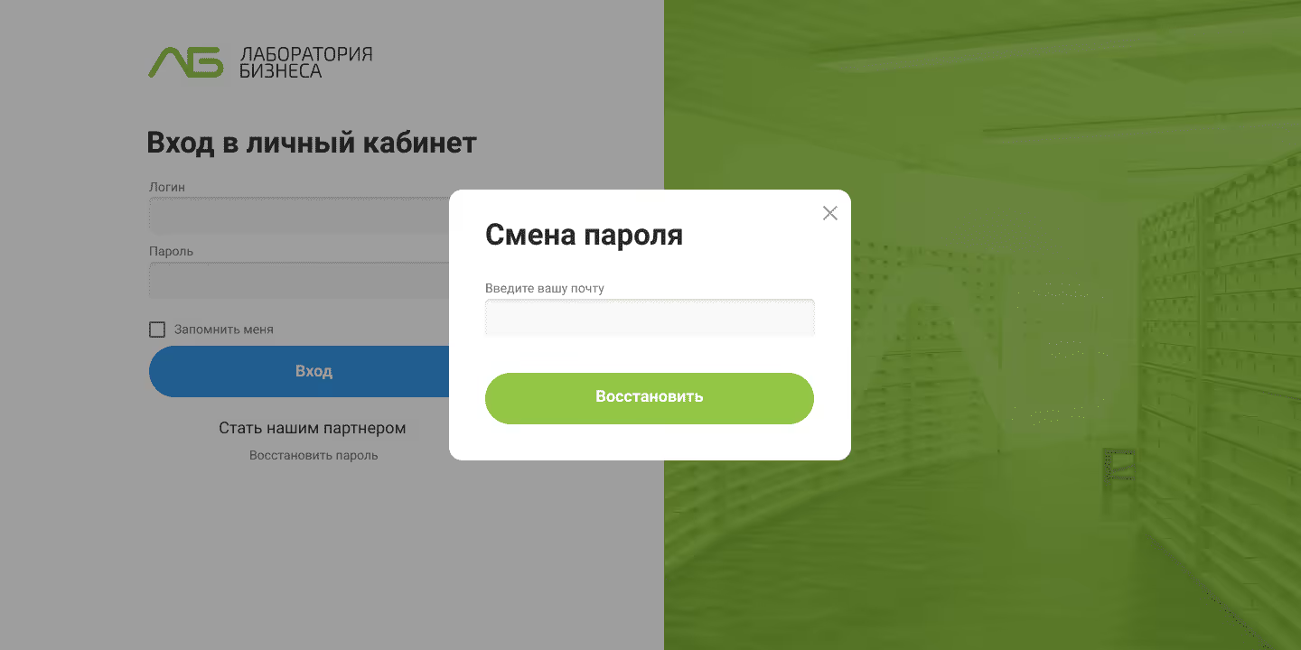
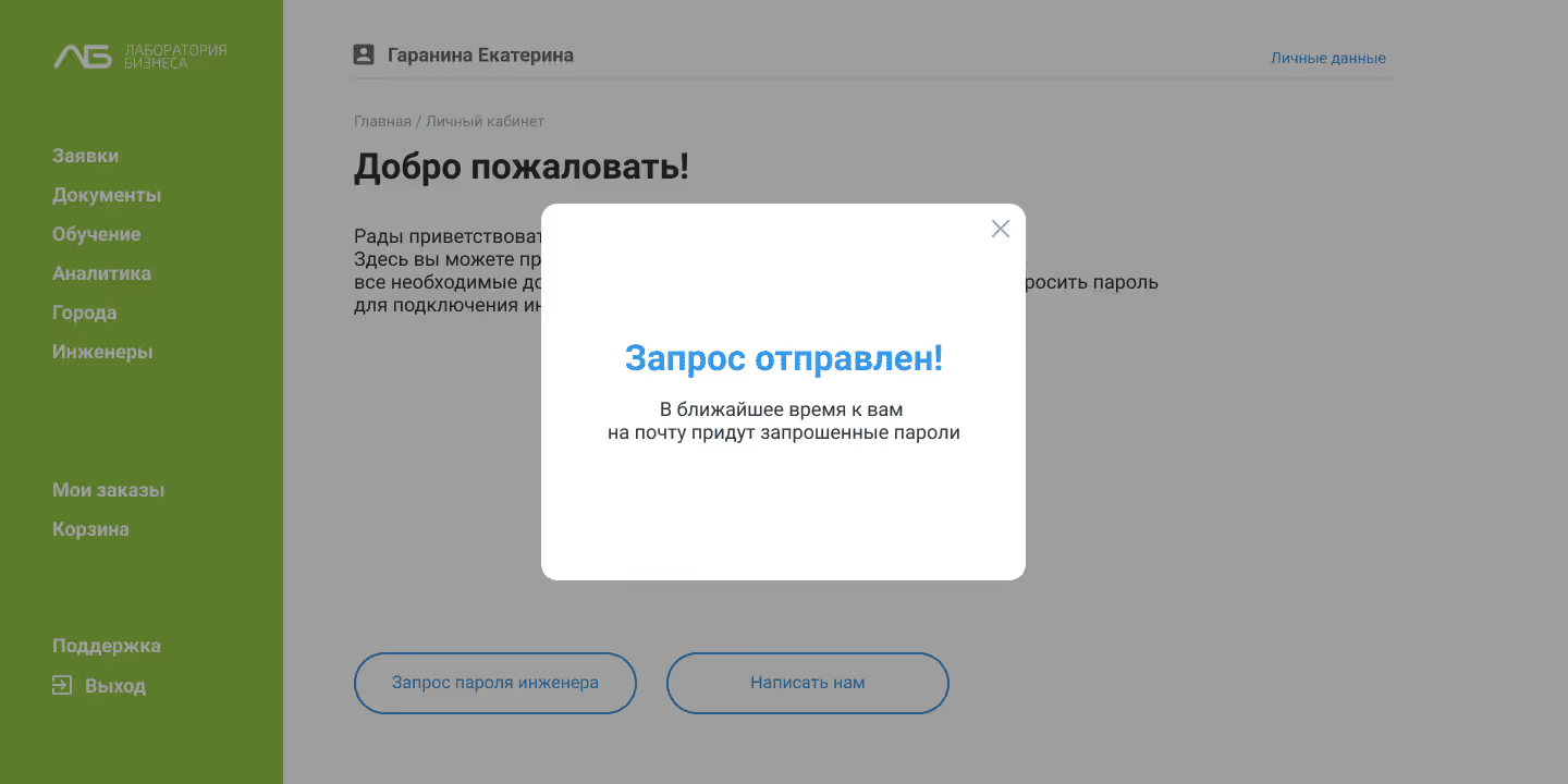
Lab of Business

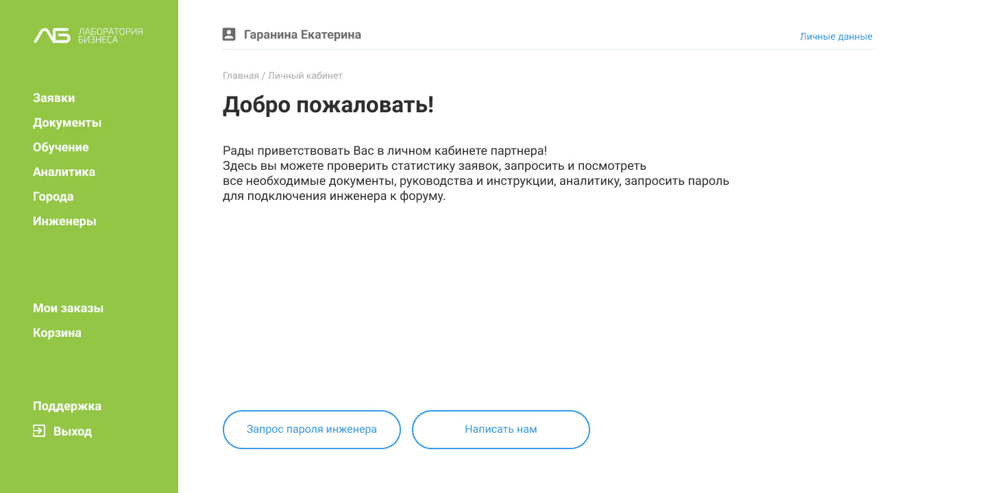
B2B Platform and Partner Dashboard

My role:
product designer
Fields:
retail, medical devices
Year:
2020

about product

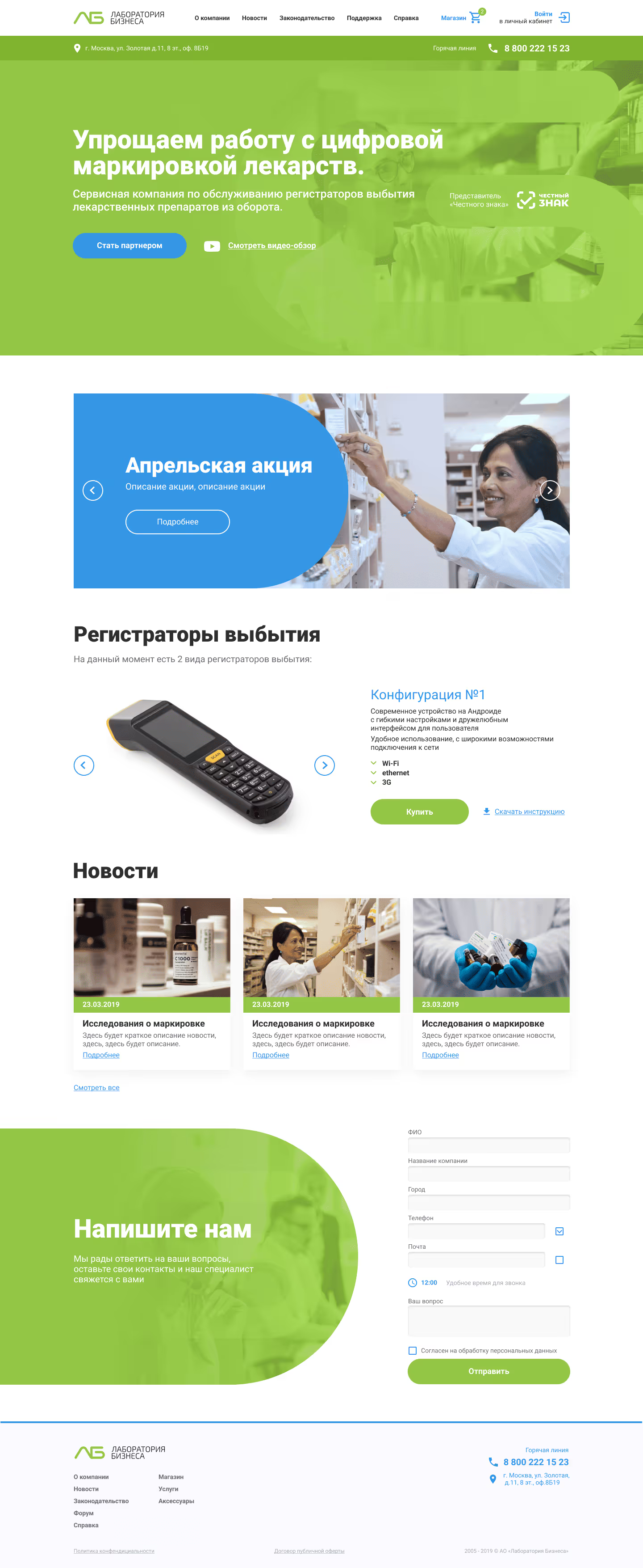
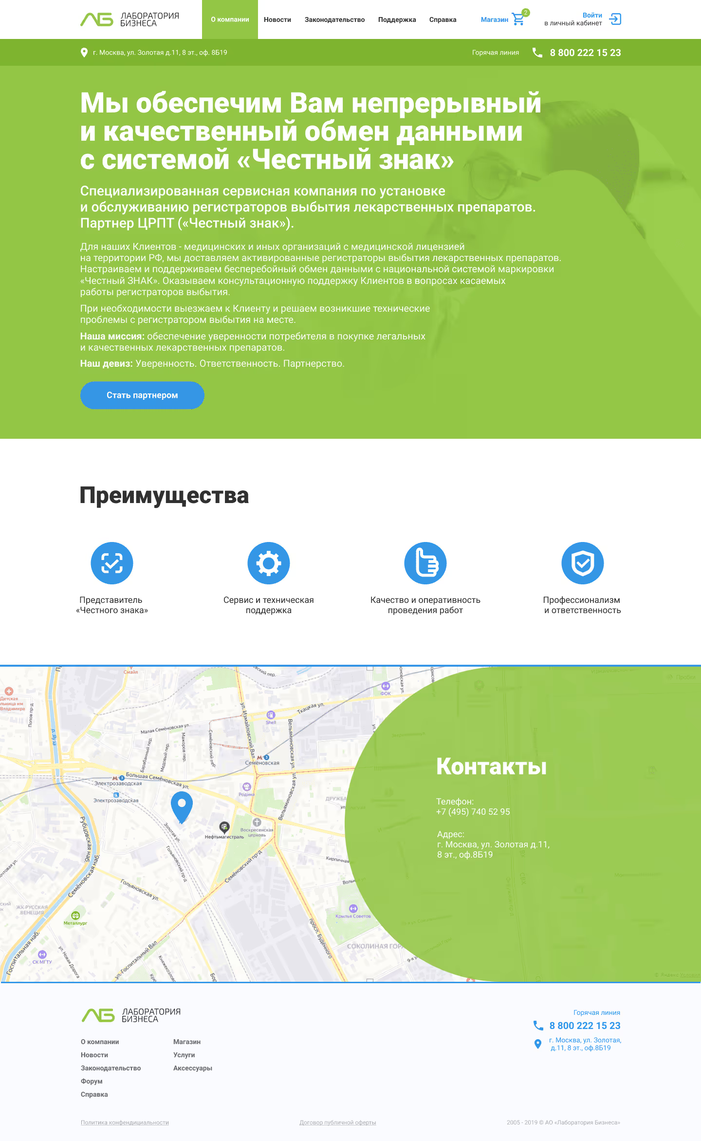
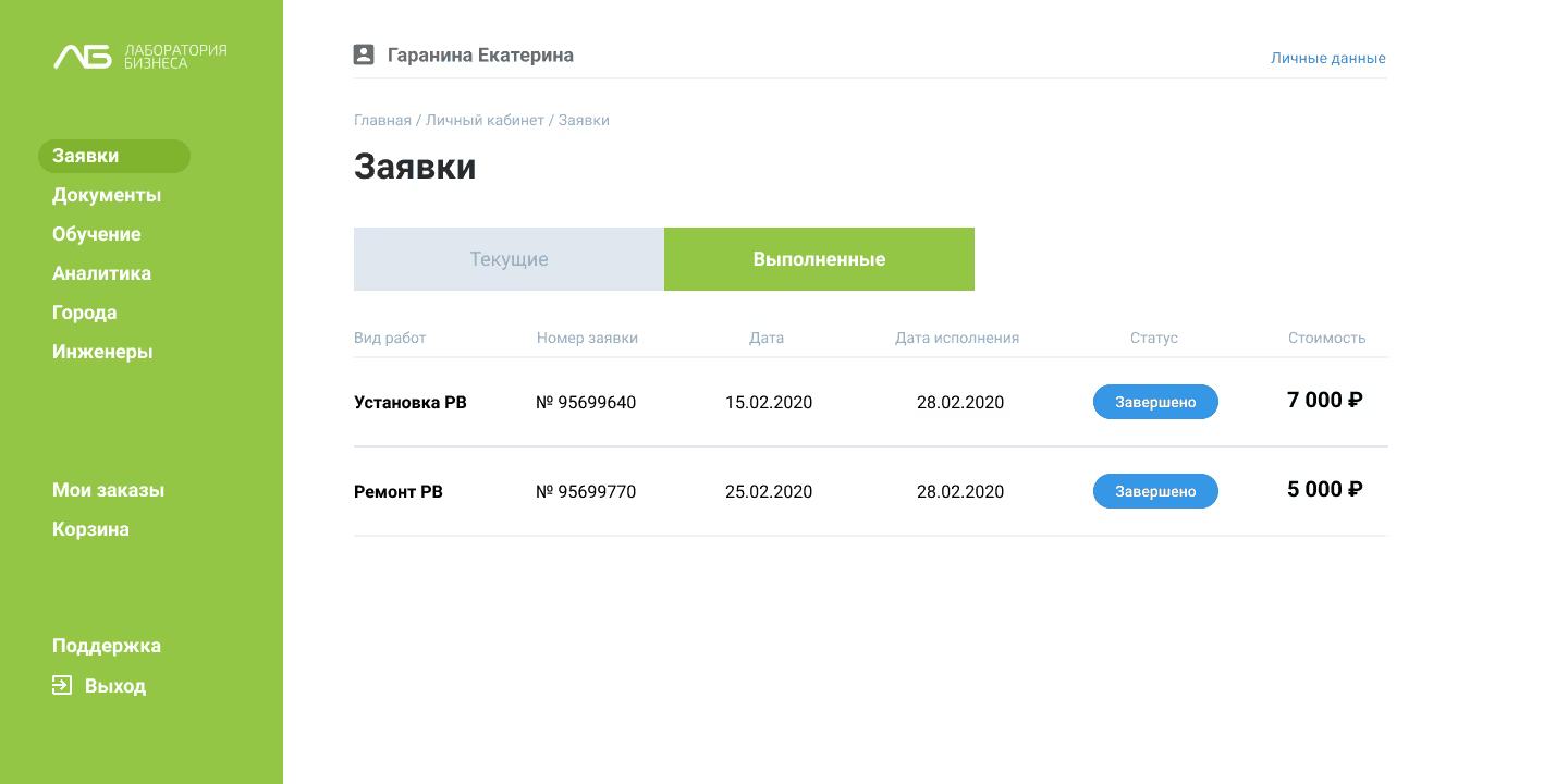
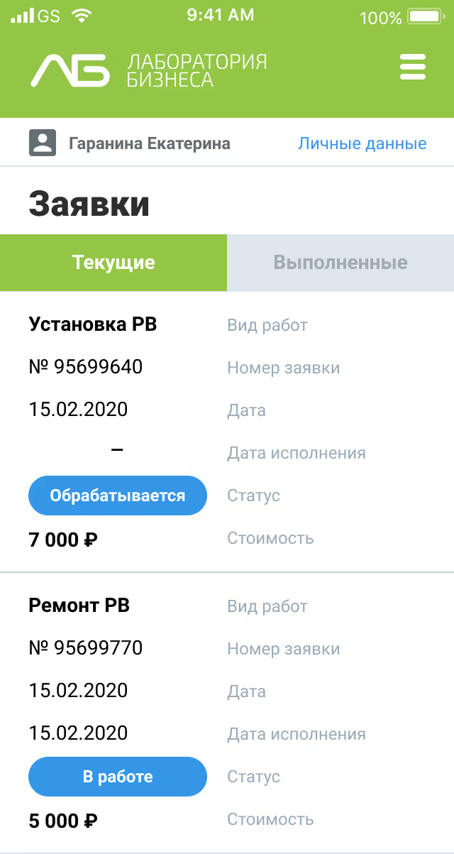
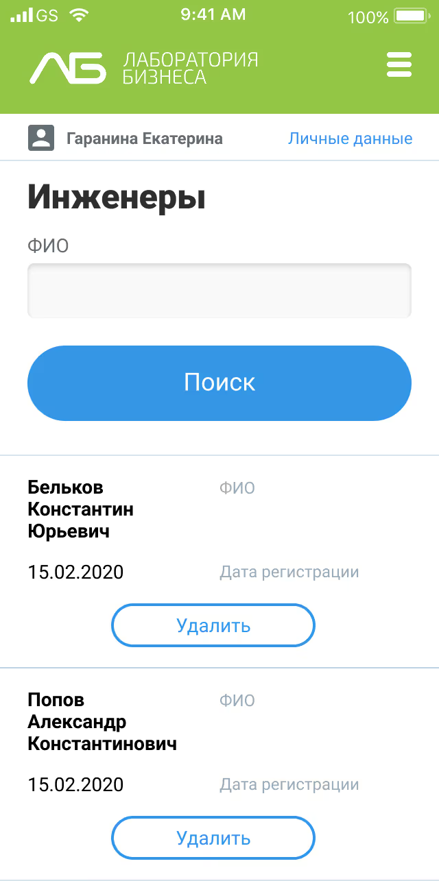
The company provides delivery, setup, and maintenance of devices for medical organizations across Russia, supporting integration with the labeling system

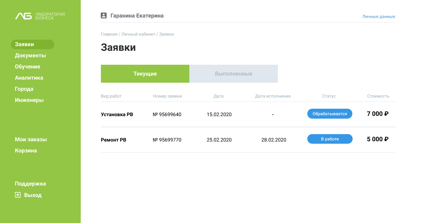
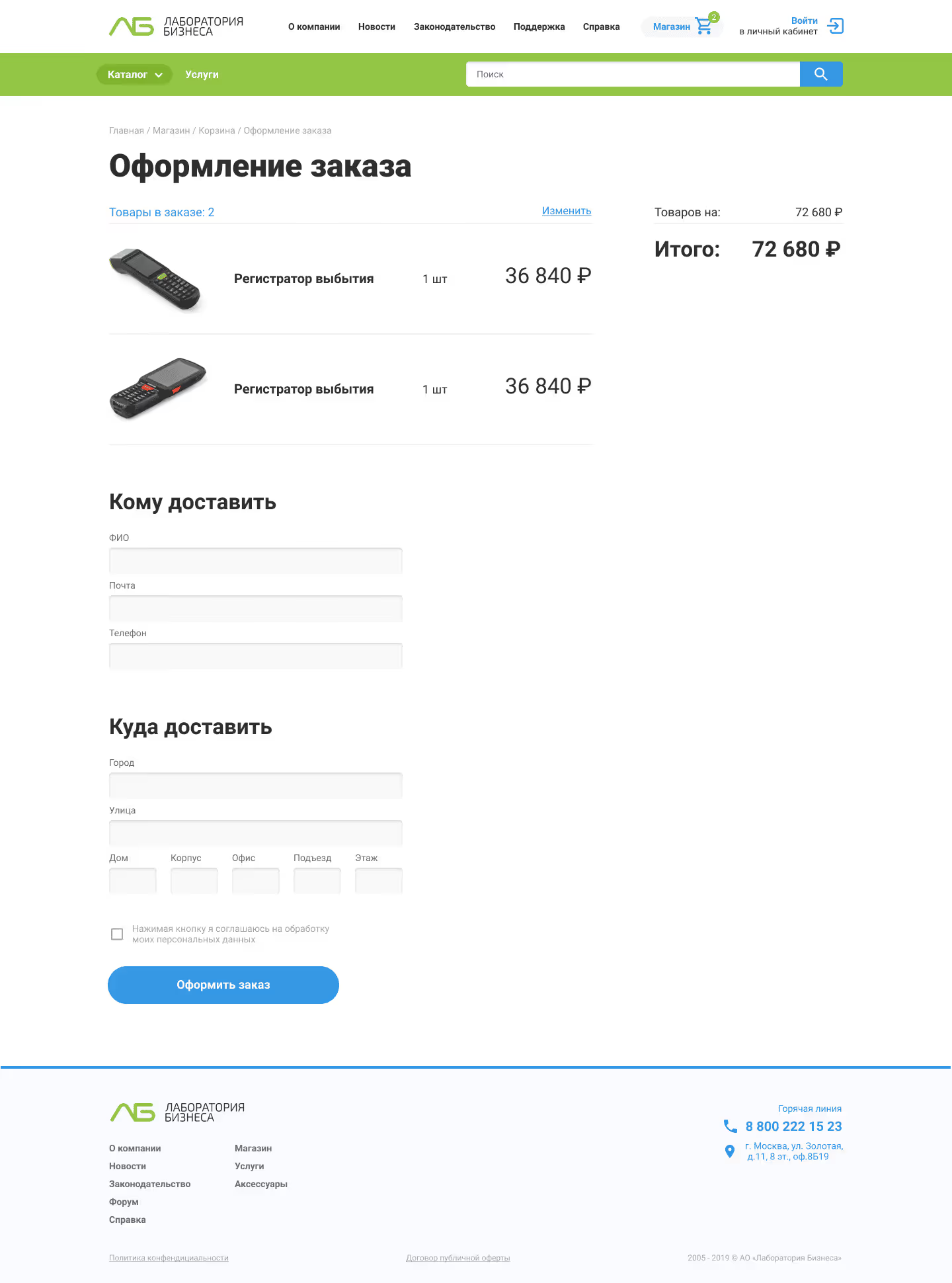
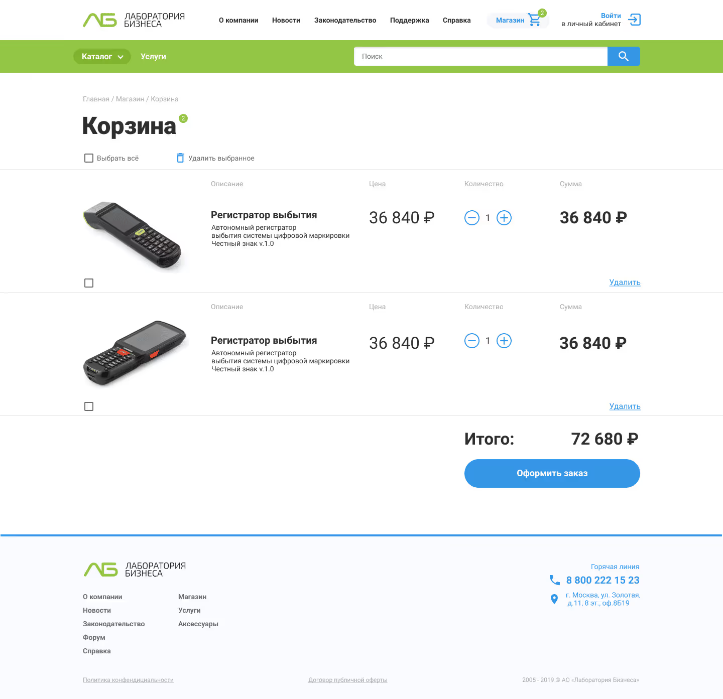
The first MVP focused on validating user workflows, simplifying equipment registration

current pains

Through stakeholder interviews and workflow analysis, we identified several recurring challenges medical organizations face:

  • Complex and unclear registration and installation processes
  • Manual processes causing delays and operational risks
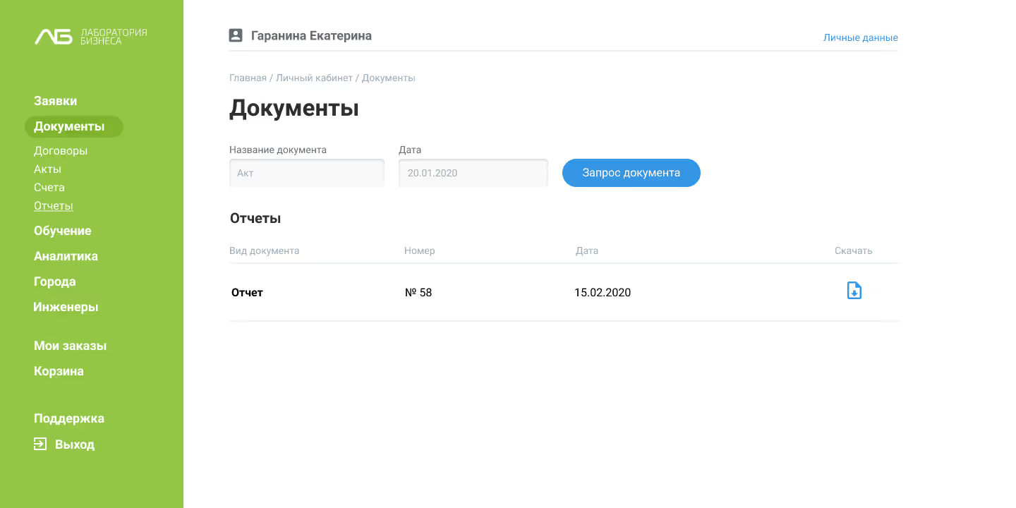
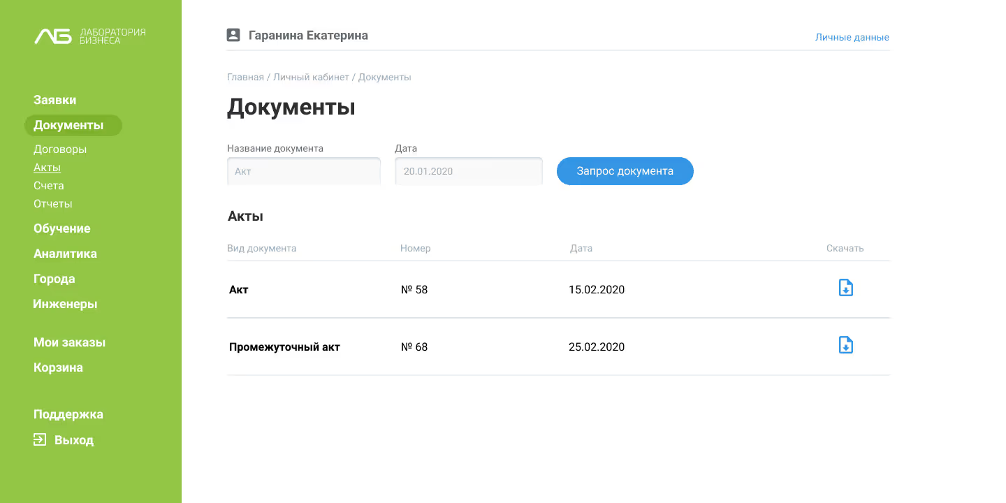
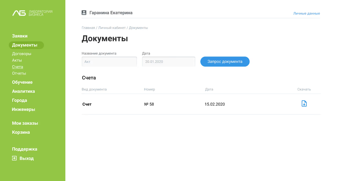
  • Fragmented documentation and inconsistent instructions
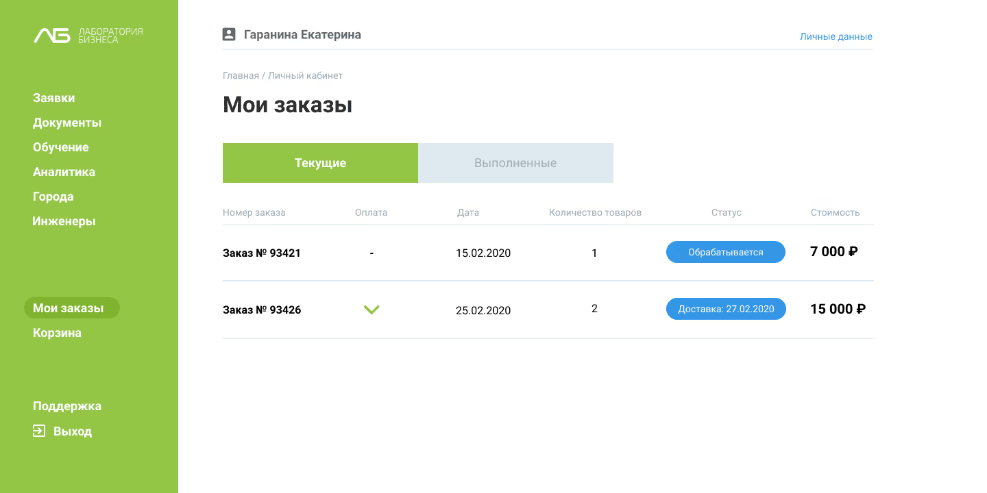
  • Difficulty tracking equipment status and resolving errors quickly

Goals

  • Streamline the registration and onboarding of decommissioning equipment
  • Reduce the load on support teams by introducing guided workflows
  • Minimize errors during setup and daily use
  • Prepare the system for gradual automation and platform scaling

Logo

The visual identity follows a principle of functional clarity with light emotional accents — clean, minimal, and trustworthy, suitable for a regulated medical environment

color system

Main colors

Color name

HEX code

green

#94c646

dark green

#80b42e

blue

#3596e5

dark blue

#127ed6

black

white

Additional colors

Color name

HEX code

dark gray

#7d89a3

mid gray

#a7b2c9

cold gray

#c9d3e8

gray

#dde5f6

light gray

#f3f7ff

error

#e91b55

Typography

Font family: Roboto

Titles

Type

Weight

Size

Line height

H1

black

58 px

110%

H2

black

48 px

110%

H3

bold

33 px

110%

H4

bold

18 px

120%

Body

Type

Weight

Size

Line height

P1

regular

18 px

120%

P2

regular

16 px

140%

P3

regular

14 px

140%
Components

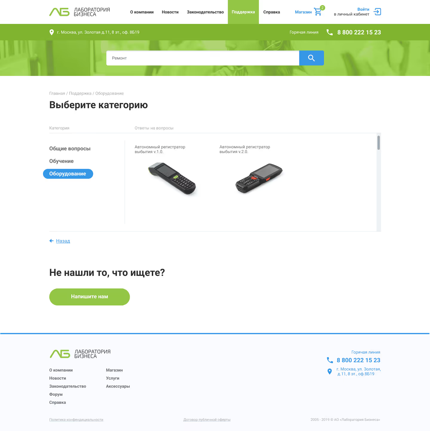
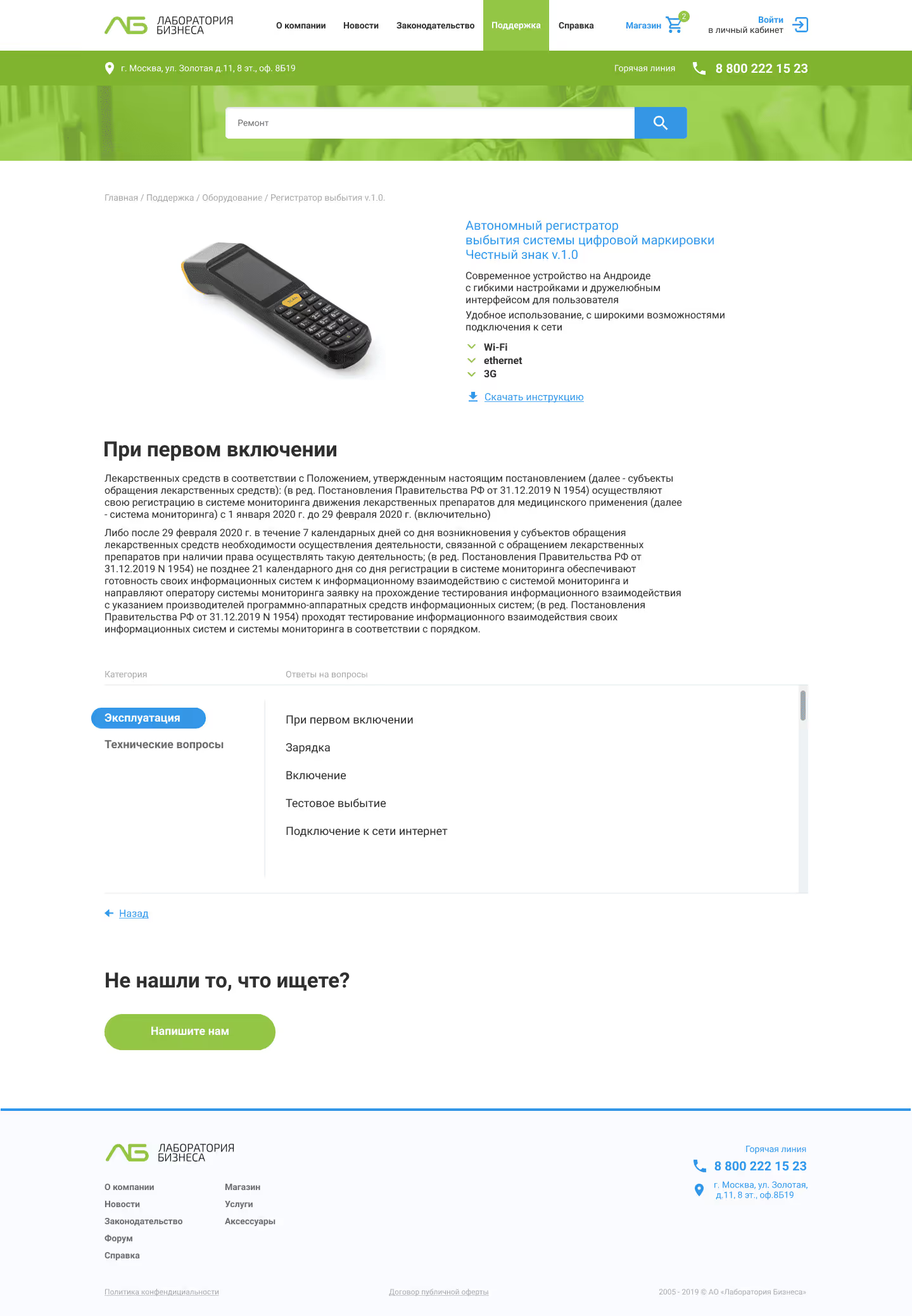
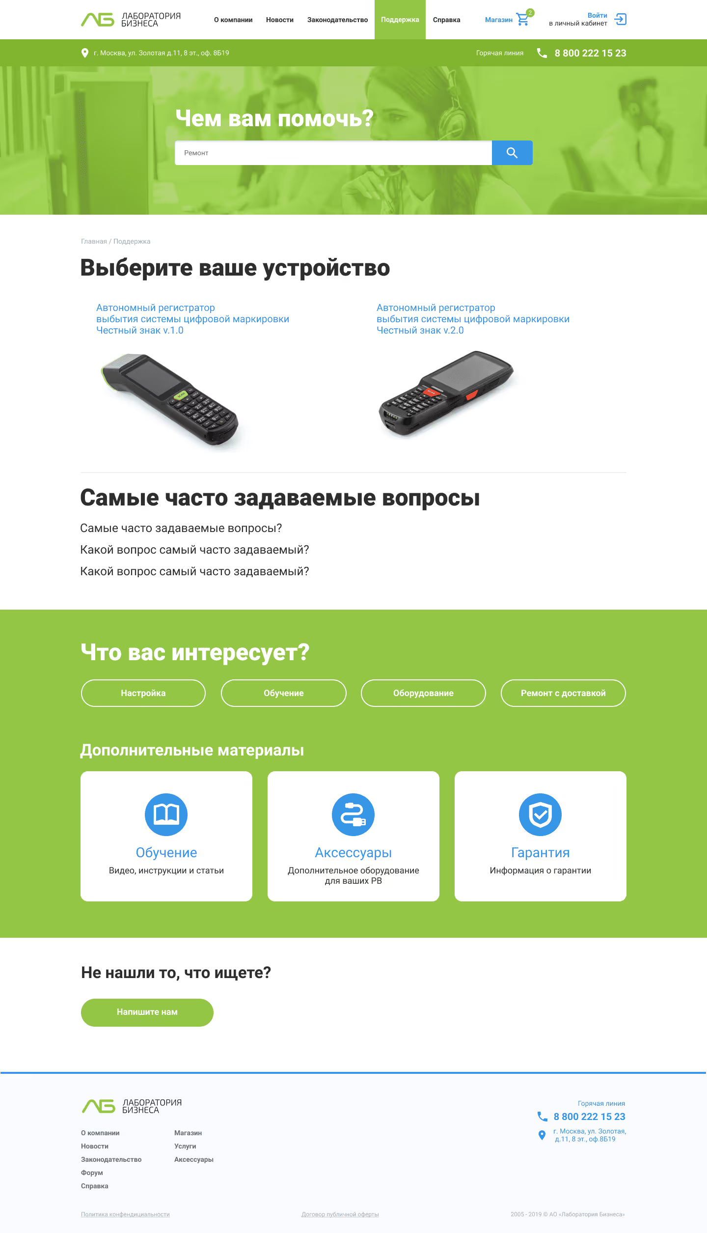
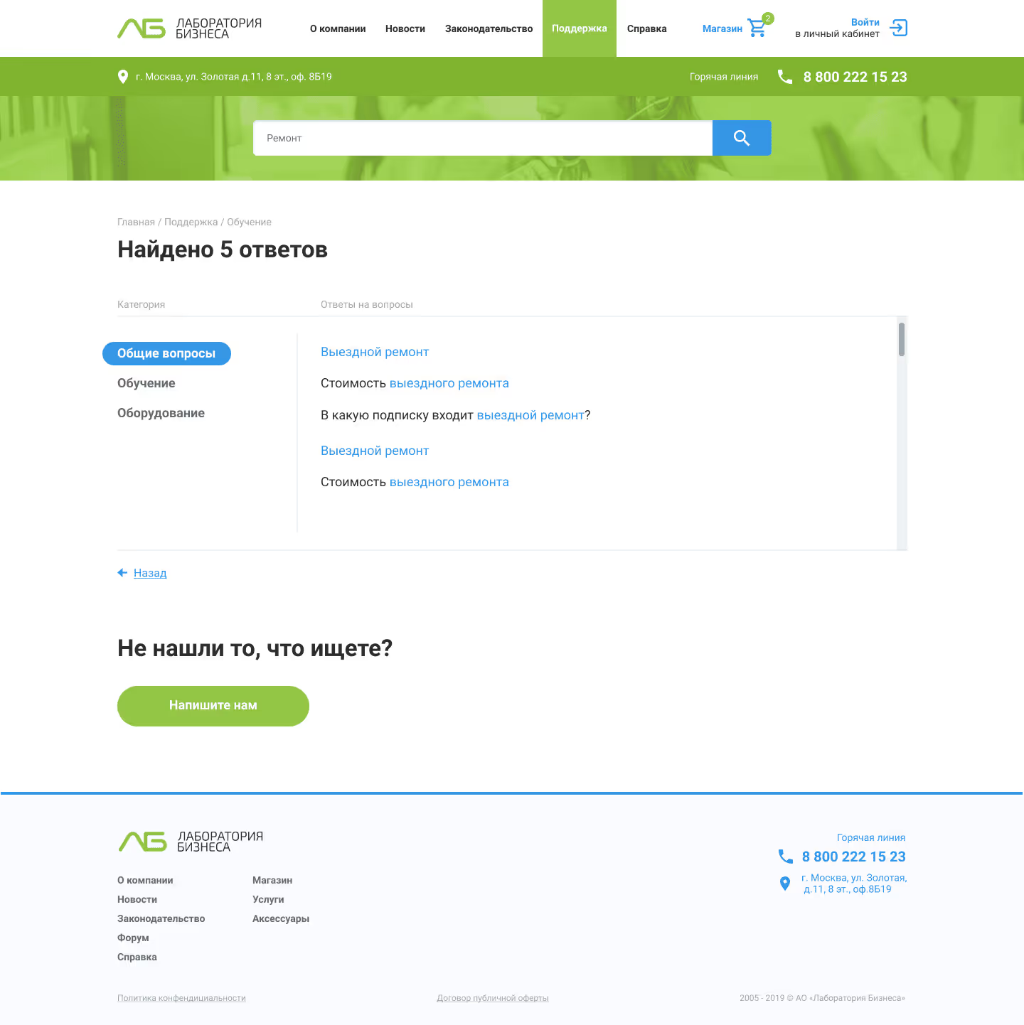
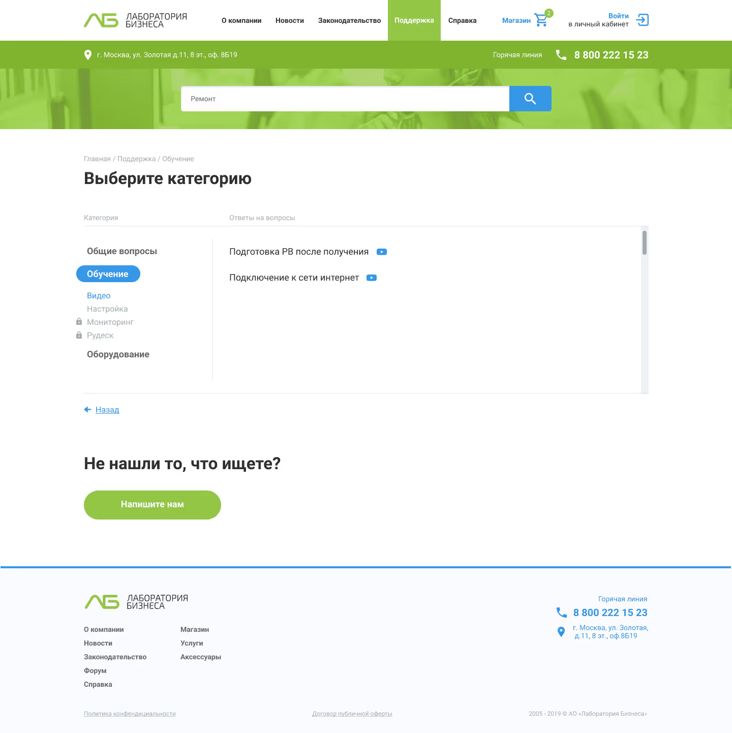
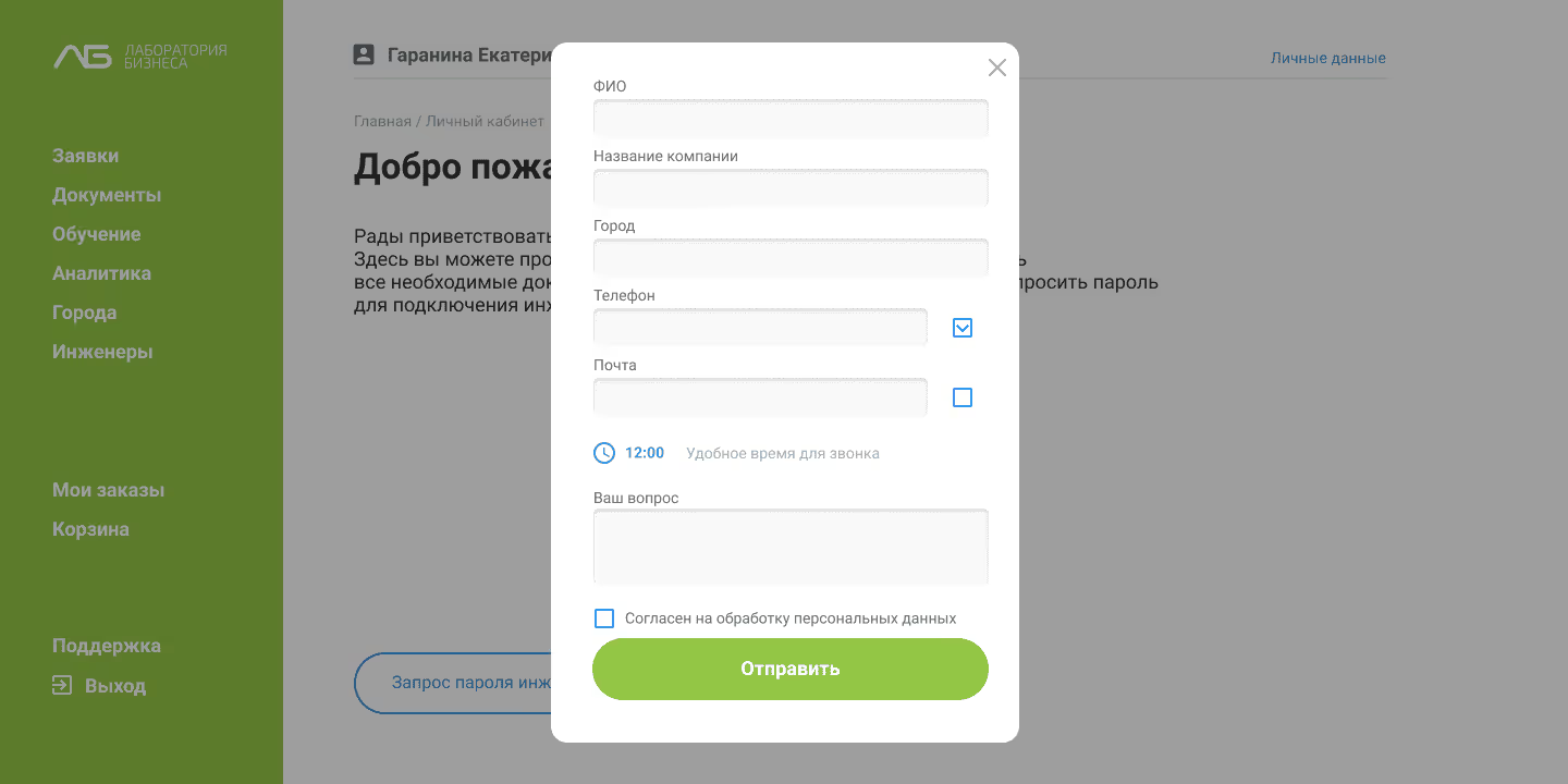
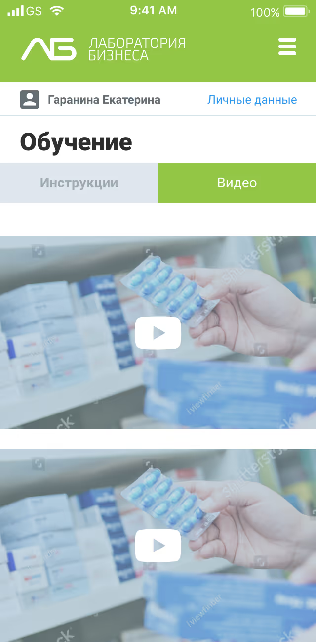
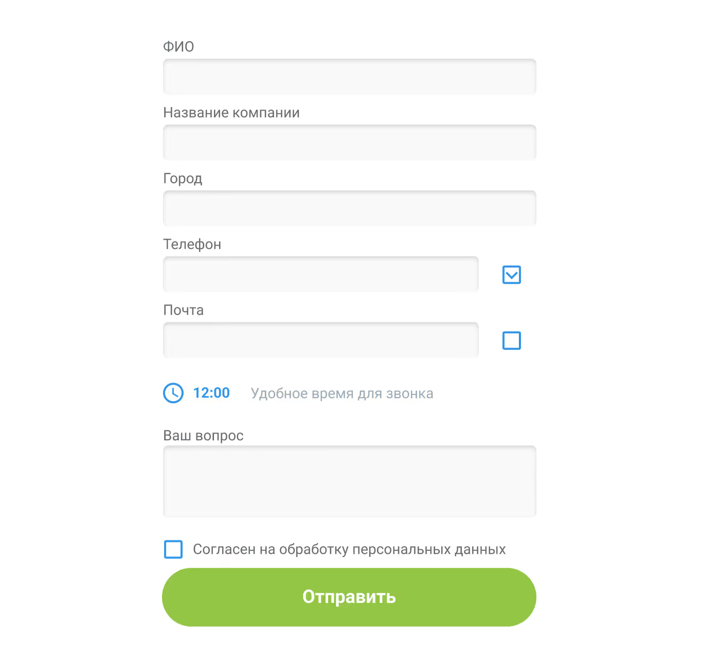
Support form

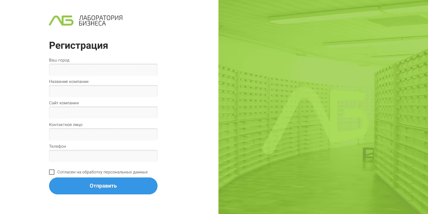
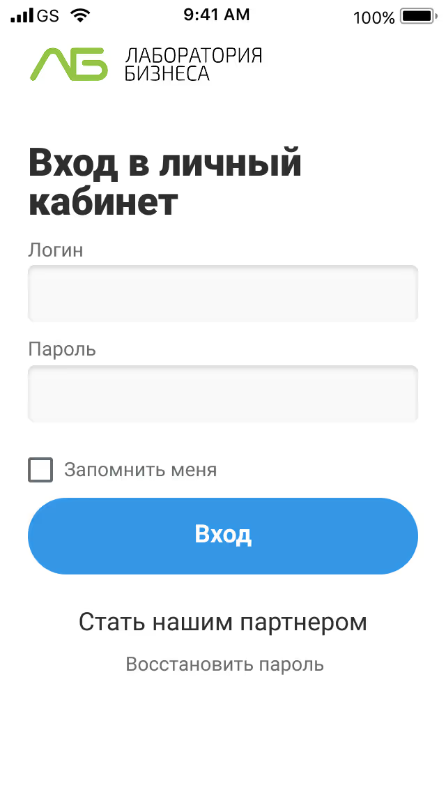
Enter form

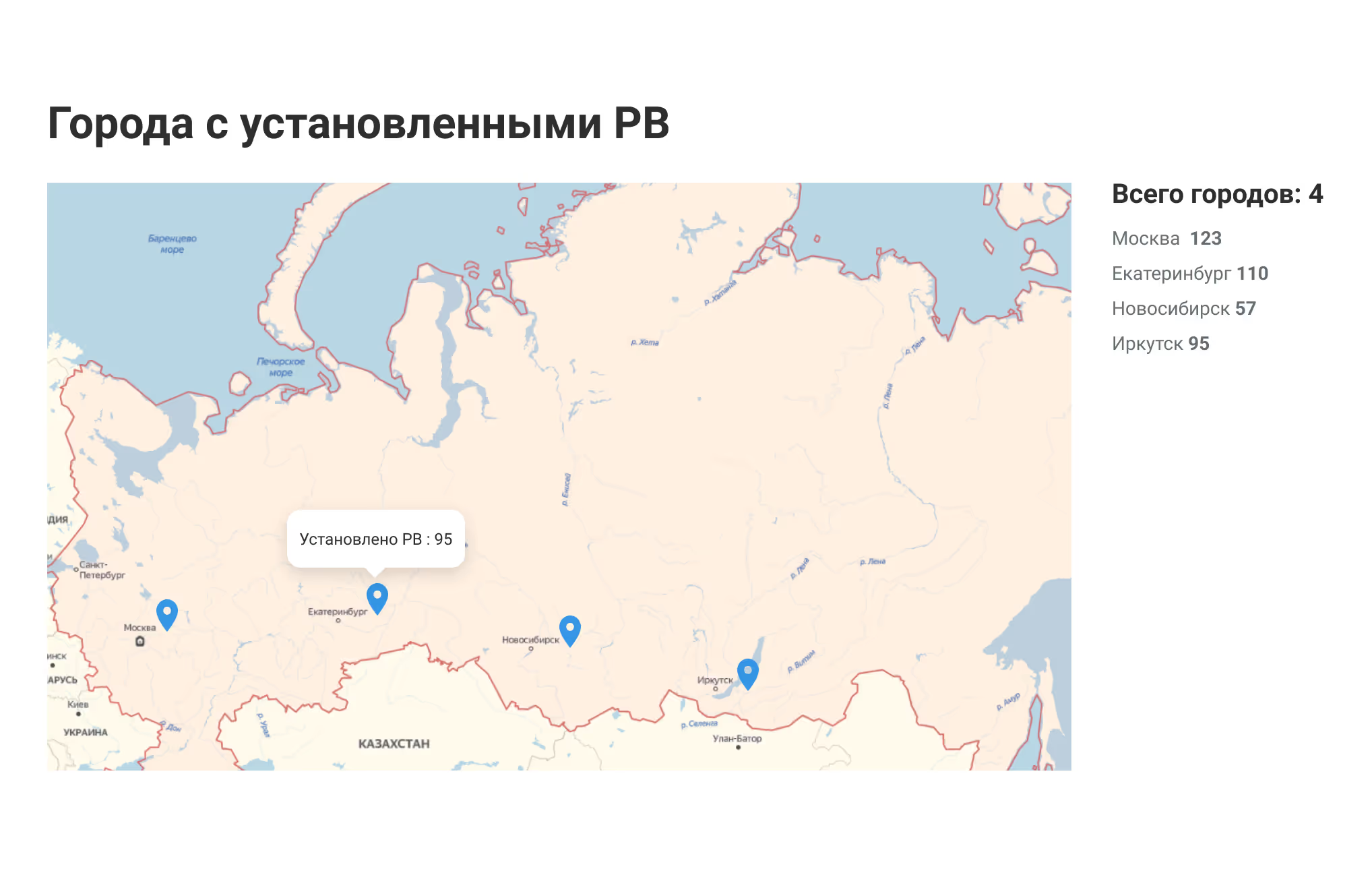
Map

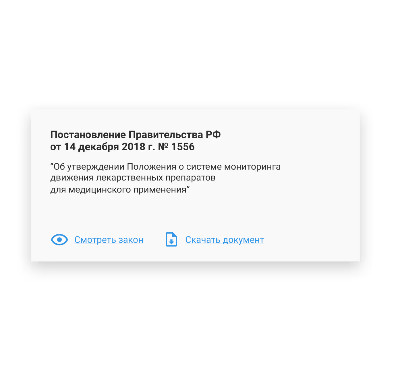
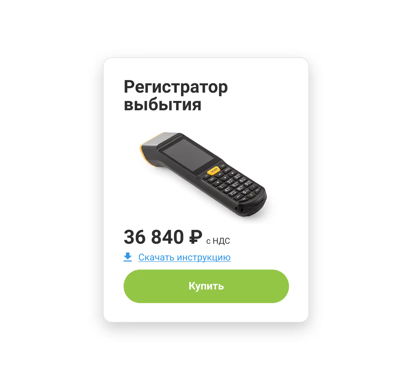
Law card

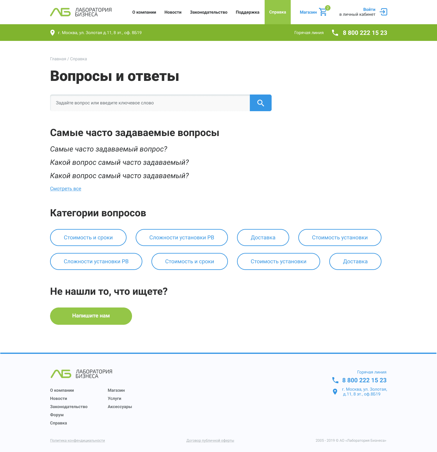
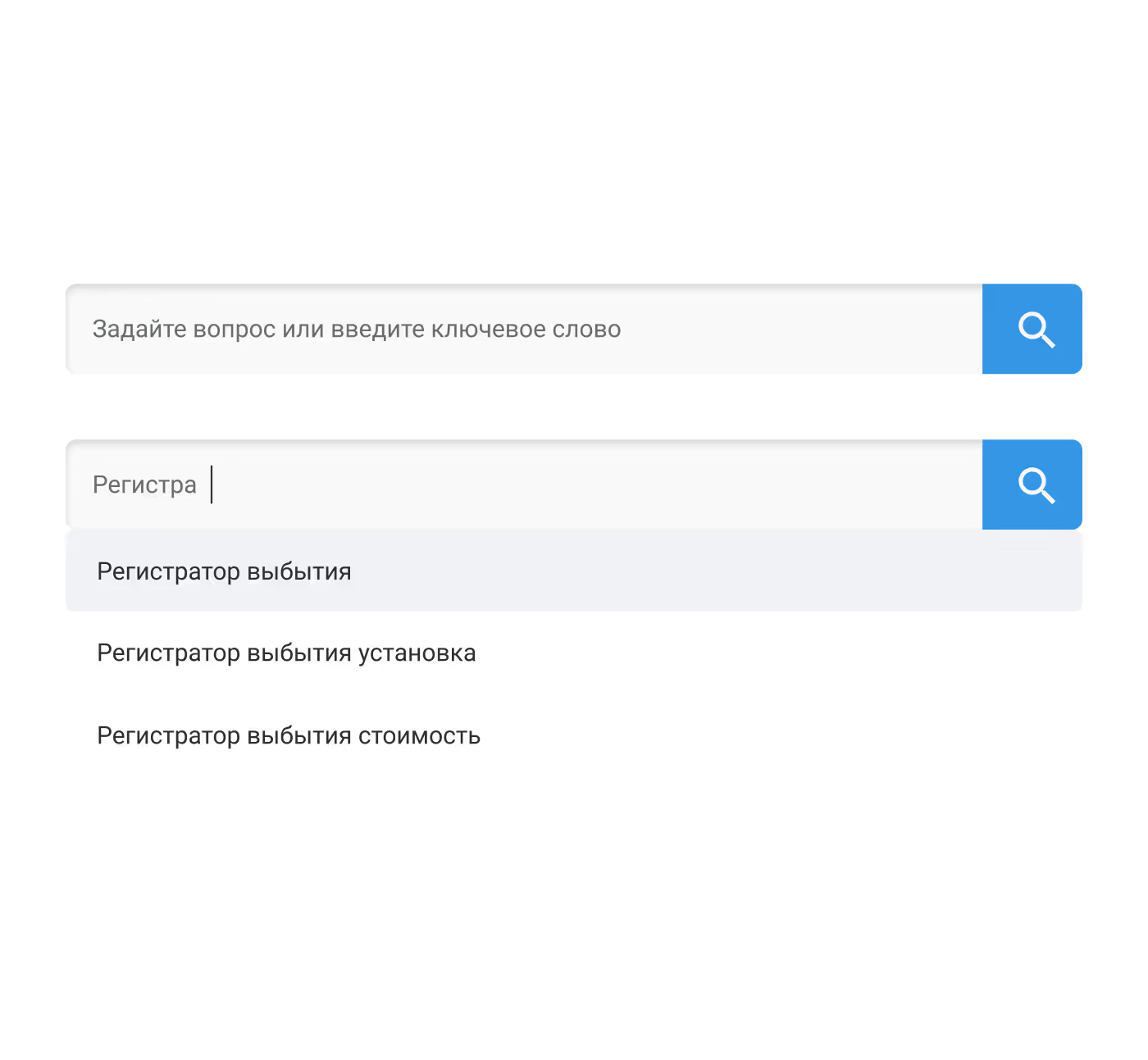
Search

Product card hover

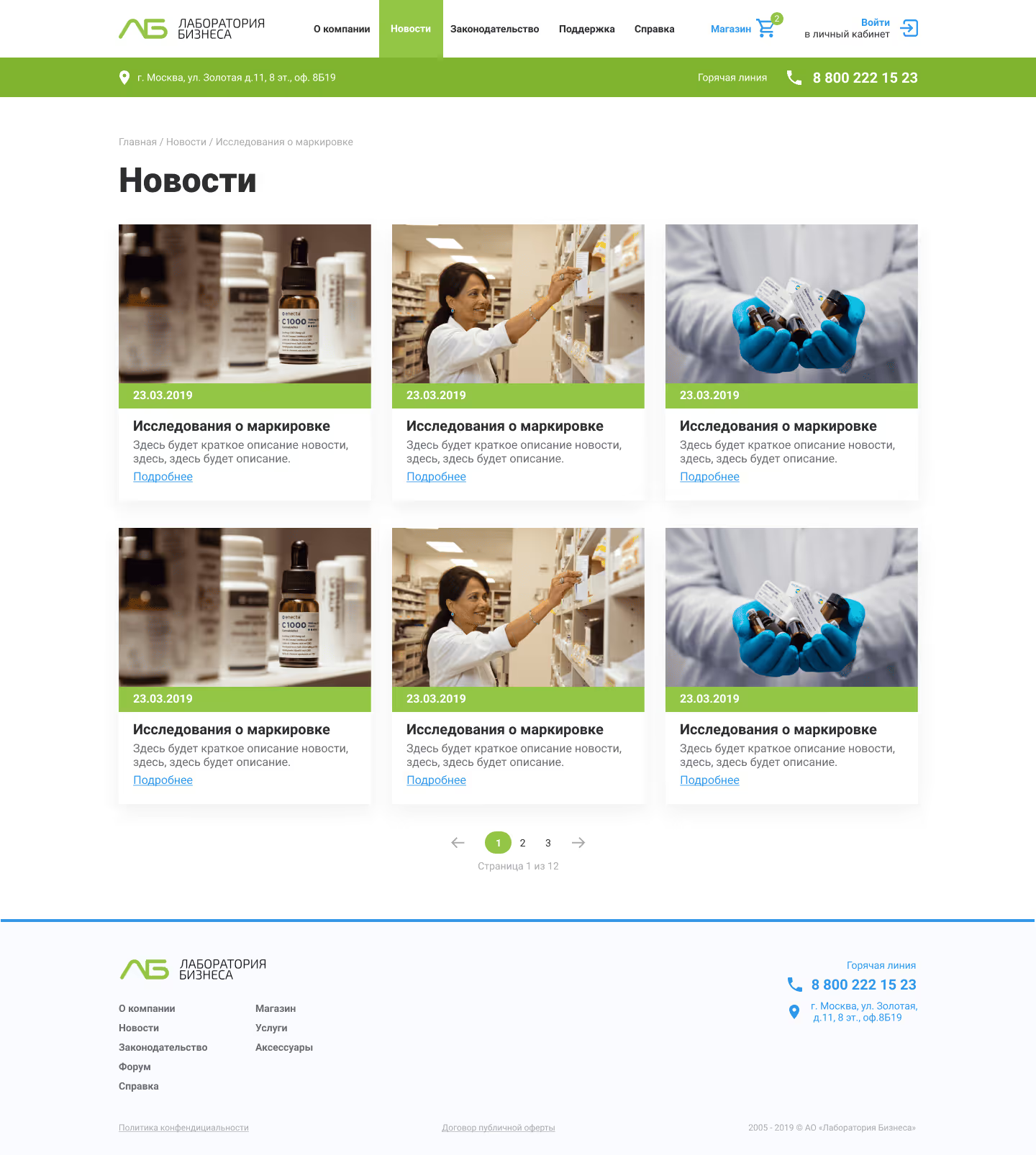
News card

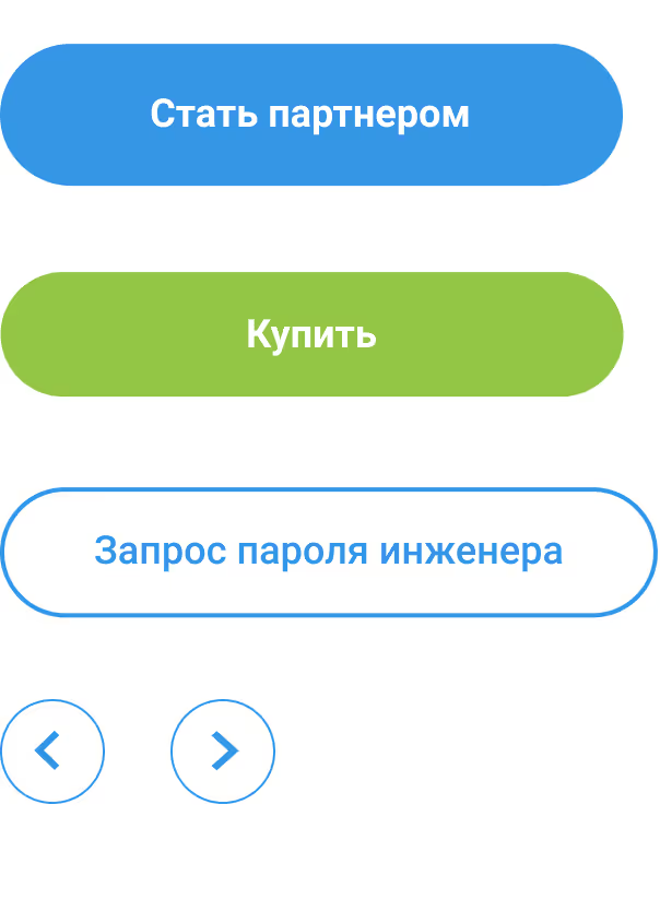
Buttons

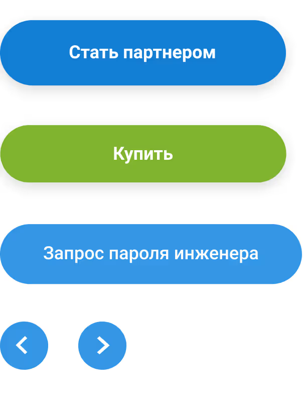
Buttons hover

Icons

Competitive Analysis

Category

Competitor

Type

Key Features

UX Observations

Strengths

Weaknesses

Pharma
Chestny ZNAK
Direct
Registration of participants, device linking, data reporting
Overloaded interface, complex terminology, few visual cues
Official reliability
High entry barrier, form overload
CRPT Partner Dashboard
Direct
Device management, reporting, data exchange
Multi-level navigation, minimal guidance
Full functionality
Outdated UX, not responsive
Technical support
1C:ITS
Indirect
Customer support, knowledge base, ticketing
Logical but visually heavy
Structured content by topic
Poor visual hierarchy
Rostelecom business dashboard
Indirect
Service management, contract handling
Modern UI for 2020, task-centered
Clear service cards
Too many steps, slow response
Finance, reporting
SberBusiness online
Indirect
Analytics, transactions, reporting
Pleasant visual language, clear hierarchy
Balanced UX, intuitive
Not adaptable beyond finance
Tinkoff Business
Indirect
Client management, analytics, document workflow
Modern UX, card-based interface
Intuitive cards and filters
Limited to financial context
Government, B2G Portals
Gosuslugi.ru
Indirect
Registration, payments, document handling
Step-by-step process, many hints
Familiar flow, trustful
Visually dense pages
CRM / Support Systems
Bitrix24
Indirect
CRM, task & ticket management, analytics
Feature-rich but complex
Centralized data
Excessive for simple workflows
Zendesk
Indirect
Ticketing, help center, search
Intuitive, efficient self-service
Excellent FAQ logic and automation
Not adapted to Russian B2B context

Interviews

We conducted interviews with support engineers, account managers, and end users to understand their workflows and daily problems

Respondents
Age:
27–55
Gender:
80% male, 20% female
Count:
8 people
Quote 1
“Most issues happen because instructions are unclear or scattered”
Quote 2
“Clients often depend on engineers for basic steps — it slows everything down”
Quote 3
“We need a system that shows statuses clearly, not through manual calls”

HYPOTHESES

Based on research insights, the MVP aims to test the following hypotheses:

Structured, step-by-step workflows reduce the number of support requests
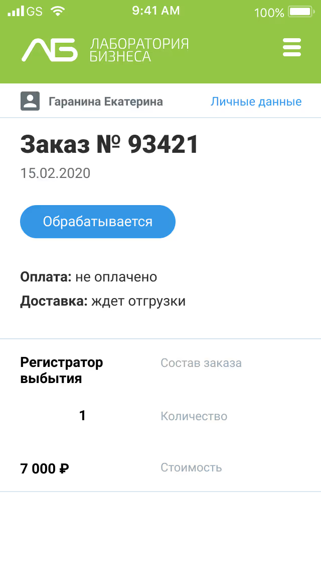
Clear status tracking increases user confidence and decreases operational delays
Guided onboarding improves the success rate of equipment registration
Consolidated documentation reduces the time users spend searching for answers